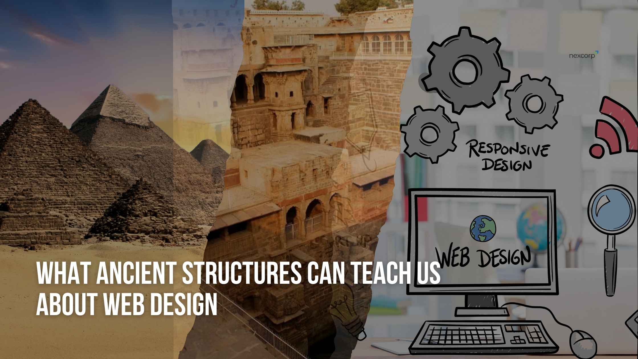
What Ancient Structures Can Teach Us About Web Design
When you hear the word “web design”, your mind probably jumps to pixels, plugins, and pages, not ancient temples or stone-carved pyramids.
But what if I told you the foundations of modern web design principles were laid thousands of years ago? What if the secrets to creating a high-converting website, a clear user journey, and a visually balanced layout were hiding in the ruins of civilizations that existed long before Wi-Fi?
This article explores the fascinating overlap between ancient architecture and website design in 2025, and the deeper lesson they both carry: great design is timeless.
From the perfect symmetry of the Egyptian pyramids to the intentional flow of Roman temples and the intricate functionality of Indian stepwells, we’ll look at how these structures were built not just to impress, but to guide, last, and serve a purpose.
And maybe, just maybe, it’s time we start building websites the same way.
Whether you’re a solo founder, a curious designer, or someone who simply appreciates clean, high-performance websites, this piece will give you a fresh lens on how design should feel, and what it should do.
Because timeless UX doesn’t need to be loud, it just needs to be intentionally built.
Timeless Design vs Trendy Design
Open Instagram or Dribble and you’ll find websites dripping with animated text, floating buttons, flashy transitions, and layouts that make your head spin. They look cool. They feel futuristic. But wait a few months, and most of them age like milk.
That’s the problem with most trendy website design today, it’s built for likes, not longevity. It’s flashy, not functional. Loud, not lasting.
But what if we flipped the script? What if instead of chasing trends, we borrowed inspiration from the world’s most enduring structures, ones that have stood tall for centuries, designed with nothing but human instinct, basic tools, and a deep understanding of flow and function?
Because here’s the truth no one likes to say out loud: A beautiful website that confuses the user, takes forever to load, or breaks on mobile isn’t well-designed, it’s just dressed up.
In contrast, timeless web design doesn’t try to impress. It tries to work, every single time, on every device, for every user. It focuses on structure, clarity, and purpose, the same values that guided the hands of ancient builders when they carved stone into story, and architecture into emotion.
Trendy is temporary. Intentional design is forever.
As we step deeper into website design trends for 2025, this article invites you to look backward, at pyramids, temples, ancient water systems, to uncover the forgotten wisdom that could shape the modern UX principles of today’s digital world.
Because in the end, whether you’re stacking stones or stacking divs, the rules of good design haven’t changed. Only the tools have.
Form ever follows function. ~ Louis Sullivan, Father of Modern Architecture
Pyramids, Parthenon, and Stepwells, Hidden UX Lessons
Think about this for a second:
The Great Pyramid of Giza was built over 4,500 years ago, with no modern machinery, no AI, no Photoshop, no Figma. Yet it’s mathematically perfect. Aligned to true north. Structurally flawless. Still standing.
Or look at the Parthenon in Athens, its proportions follow the Golden Ratio, the same formula today’s designers use in logos, layouts, and responsive grids.
Even ancient Indian stepwells like Rani ki Vav weren’t just for water, they were designed for navigation, functionality, beauty, and human movement. Sound familiar?
These weren’t just monuments, they were early UX masterpieces.
So what exactly can we learn from them?
1. Structure Comes First
Before decoration came the foundation. Before color and style came balance and proportion. In today’s terms: Before you animate anything, map the layout.
Ancient builders understood that structure creates flow, and that’s the first rule of user experience design too. A messy page with no hierarchy is the digital version of getting lost in a temple with no signage.
2. Guide the Journey, Don’t Force It
Stepwells were designed so you descend gradually, with resting points along the way, visual breaks, ambient shade, and subtle turns. That’s basically the same logic behind a scroll-based landing page, let the user move with ease, don’t hit them with noise.
The best UX design doesn’t demand attention. It earns it, by giving people space to explore.
3. Function and Form Must Be One
In the Parthenon, every column wasn’t just aesthetic, it held weight. Every detail had purpose. Every line was intentional.
It’s the same today: a button shouldn’t just “look nice”, it should feel clickable, load fast, and work on every screen size. The best designers, like ancient architects, build with purpose first.
Final Thought for This Section:
Modern UX design often chases beauty and ends up breaking function. But the ancients had no luxury for fluff, their design was pure, useful, and long-lasting.
If a structure can last a thousand years in the real world, imagine how long a well-built website layout could last in the digital one.
Structure That Speaks, Architecture as Communication
Walk into any ancient temple or monument, and you’ll realize something, they were never silent.
They spoke through their layout. Through their symbols. Through their carvings. Every path, every pillar, every curve was part of a message.
Before there were websites, landing pages, or logos… there was architecture as communication.
Temples Told Stories
Ancient builders didn’t have screens, they had stone. But they still knew how to guide people through an emotional journey.
- You’d enter from the east.
- Walk past imagery that revealed deeper meaning.
- Move toward a central space, lit dramatically by natural light.
- It was intentional narrative flow, just like a great website.
That’s brand storytelling through design at its purest.
Today, your homepage should do what temples did, welcome, guide, reveal, and connect.
Icons, Symbols, and Typography, The Old Language of Design
Think about hieroglyphics in Egypt or the carvings at Angkor Wat, they were the original UX elements.
They simplified complex stories into visual cues anyone could understand. Just like we use icons, headings, color contrast, and CTAs now.
When a website lacks a clear visual hierarchy, it confuses the user, and confusion kills conversion. That’s why UI as communication is more important than decoration.
Clarity Is the Ultimate Luxury
Ancient structures didn’t overwhelm you with randomness. They guided your eye. They made you feel something.
Modern websites should do the same.
- Use clear contrast.
- Place elements where the eye naturally flows.
- Let your design language speak for your brand, even before a user reads a word.
The best website design is one that communicates silently, through spacing, rhythm, and layout, just like a temple did through stone.
Because in design, saying less clearly is more powerful than saying more loudly.
Durability and Performance, Design That Survives
Here’s something wild to think about: The Colosseum in Rome has survived wars, earthquakes, and centuries of erosion, and still draws millions of visitors every year.
Meanwhile, your favorite app crashes because you opened two tabs.
In the digital world, durability often takes a backseat to trends, visual effects, and bloated code. But when it comes to building something that lasts, performance and structure always win.
Ancient Builders Had No Room for Failure
They weren’t designing for A/B testing or “let’s fix it later.” They had one shot to get it right. So they focused on core integrity, not fancy exteriors.
It’s the same today. If your website looks pretty but:
- Loads in 8 seconds,
- Breaks on mobile, or
- Crashes during peak hours…
…it’s already failing at its first job: being usable.
Performance = Modern Durability
In the online world, website performance optimization is the new structural engineering.
- Your core web vitals are the foundation
- Your hosting setup is the material you build with
- And your codebase? That’s the invisible structure holding it all together
A strong site isn’t built on visuals, it’s built on speed, stability, and scalability.
Lightweight is the New Luxury
Ancient temples were built with stone. Heavy material, light experience. Today, we build with code, and ironically, most websites are heavier than they need to be.
Extra plugins. Endless animations. Sloppy backend setups.
All of this kills loading time, especially on mobile.
A truly lightweight website design feels invisible, it loads before you even realize it, like a door that opens just before you reach it.
Build Once. Maintain Forever.
The best structures in history weren’t rebuilt every year. They were simply maintained, cleaned, preserved, respected.
Your site should be the same. A high-performance website isn’t something you redesign every 6 months, it’s something you build intentionally once, and keep optimized over time.
Real strength in design isn’t how much it can hold. It’s how long it can hold, without breaking.
What Modern Designers Can Learn
So, what does all this ancient wisdom mean for us today?
We’re not moving stones or carving granite anymore. We’re designing with CSS, HTML, and visual builders. But the design principles haven’t changed, just the tools.
If anything, the rules of timeless design are more relevant now than ever.
1. Start With Purpose, Not Aesthetic
Too many websites begin with:
Let’s make it look cool.
But the ancients never built for looks, they built for function, and beauty followed. Start by asking:
- What’s the goal of this page?
- What should the visitor feel, do, or understand? That’s intentional design strategy, and it always wins over decoration.
2. Design for Humans, Not Screens
A surprising number of modern sites are built for designers, not users. They’re impressive on a portfolio… and painful to use in real life.
Like temples were built for real human movement, modern websites should serve:
- Real human attention spans
- Mobile thumbs
- Quick decisions and clear paths
This is the heart of UX best practices: don’t just design something beautiful, design something usable.
3. Let Simplicity Lead
Minimalism isn’t a trend, it’s an ancient survival tactic.
Clean website layouts:
- Load faster
- Convert better
- Last longer
- Work everywhere
- Clutter doesn’t age well. Simplicity always scales.
Simplicity is the ultimate sophistication. ~ Leonardo da Vinci
4. Build Once, Maintain Intelligently
As we saw in ancient architecture, things built with care rarely need rebuilding.
Instead of redesigning your site every 6 months, focus on:
- Strong layout foundations
- Modular sections you can update
- Performance optimization from day one
That’s how you build a future-proof digital experience.
5. Don’t Impress. Guide.
Your site isn’t a talent show, it’s a silent guide.
- It should lead people:
- From curiosity to clarity
- From confusion to decision
- From noise to trust
Just like ancient builders guided worshippers through sacred geometry and visual cues, you’re guiding users through a story, too.
Design isn’t decoration. It’s direction.
Conclusion, Build Like a Civilization, Not Like a Trend
Trends come and go. Frameworks change. Designs evolve. But the truth is, great design has always followed the same rules, across centuries, across mediums, across civilizations.
The Egyptians didn’t build the pyramids to get likes. The Greeks didn’t carve temples for engagement. And Indian engineers didn’t design stepwells just to impress royalty.
They built with intention, precision, and purpose, to solve real problems for real people.
Good design is as little design as possible. ~ Dieter Rams, Legendary Product Designer (Braun)
Today, as web designers, founders, and creators in the digital age, we’ve been given far better tools, but we’ve also become far more distracted.
- Flashy UI means nothing if it doesn’t guide the user.
- A beautiful homepage is useless if it doesn’t load.
- And a website packed with features is worthless if no one knows how to use them.
This isn’t just a call to simplify. It’s a call to think like a builder, not a trend-follower.
To prioritize function over flair, flow over fancy, impact over aesthetics.
Because at the end of the day, the best websites, like the best structures in history, are not the ones people stare at once. They’re the ones people use again and again without friction, without confusion, without even noticing the design.
That’s what we believe in at NexCorp.
Build like a civilization. Not like a trend.
Ready to build something that lasts?
At NexCorp, we don’t chase trends, we design websites with structure, speed, and soul. Whether you’re launching a new brand or rebuilding one that deserves better, we can help you create something truly timeless.
👉 Start your project today, and let’s build it like it’s meant to last.
The Team, NexCorp